Guild
Guild is B Corp that works with companies to provide their employees tuition-free education and upskilling opportunities. Guild came to Athletics after completing their branding work with another agency. We worked closely with the client team to understand what they wanted to communicate and designed an experience to meet their unique storytelling needs, while expending on their exciting new brand.
My Role
My role was the Senior UX/UI Designer on this project. I worked on a small team co-leading the UX/UI part of the project with Ana Realmuto, a Senior Designer at Athletics. We also worked with our Senior Strategy Director, Matt Colangelo, our Designer, Loli Vaccaro, and our UX/UI Intern, Stefan Nickells. We were all working under the guidance of Daniel Irizarry, our Creative Director.
Reviewing the new brand and client materials
Before we got started on our own research and discovery process, we wanted to absorb all the work that had been done to date. We reviewed the brand guidelines and client documents to learn a bit more about the company, the product features, the brand, and the future roadmap.
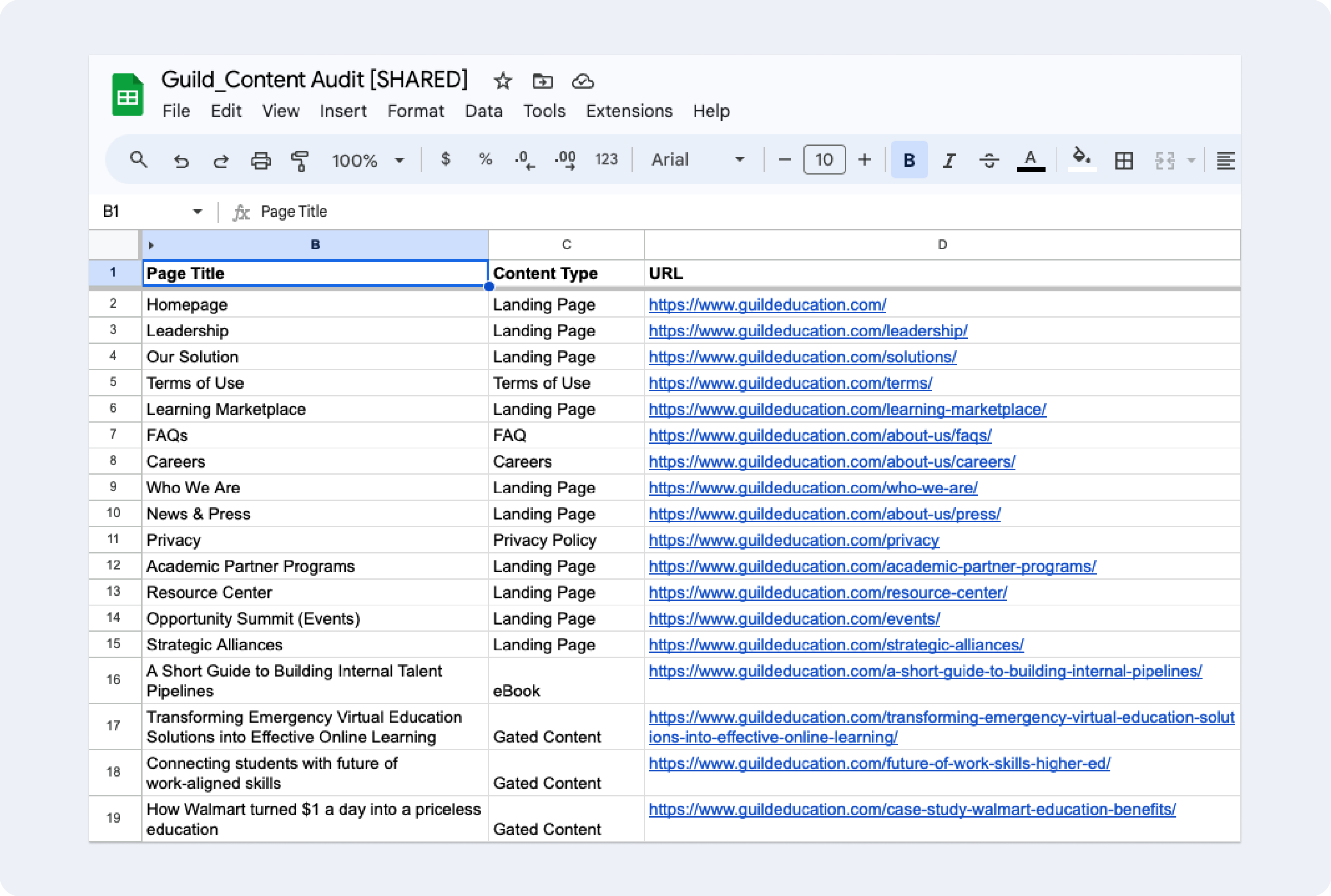
Performing a content and website audit
For the content audit, I did a site crawl to identify all of the page URLs on the current site, going through each page thoroughly, and labeling each page with a page type. This work helped plan what content would get migrated to the new site. I also worked on a website audit that focused on the overall experience and the role of content on the site.
With the findings of the content and website audit we were able to make some strategic recommendations that we carried through the site design process. We recommended to dial in the value prop and messaging throughout the site, to rethink the conversion funnel to work better for all user types, and to integrate site content more thoroughly throughout the site.
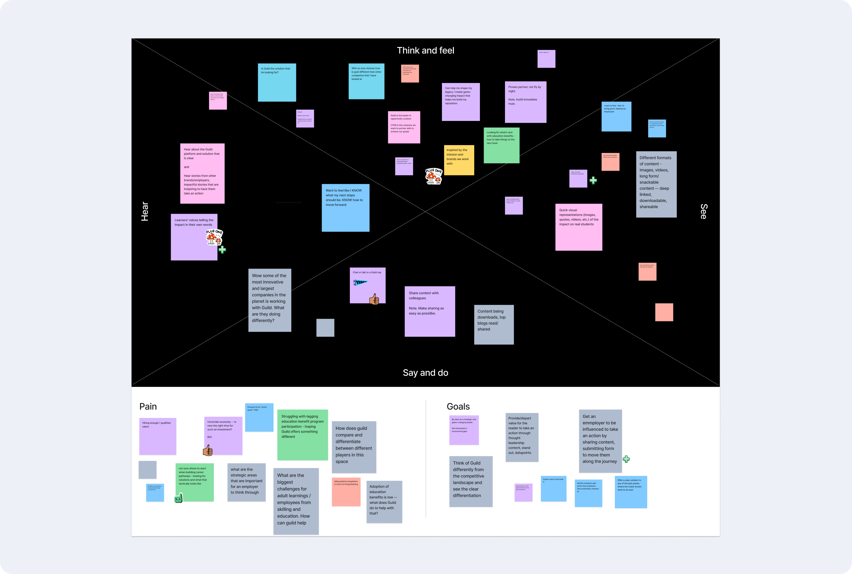
Conducting an empathy mapping workshop
The main audiences for this product were: employers (those purchasing a Guild subscription for their company), learning partners (universities, academic institutions, professional development providers, etc. who provide the education), and learners (those working at companies that have subscriptions to Guild).
I structured our empathy mapping workshop based on these audience types to better understand each one and their specific needs. The main themes coming out of our workshops were that all users should be able to: understand what Guild is and how it can bring value to them, see inspiring stories that resonate with them, and know that Guild understands them and their unique challenges.
Creating the information architecture and template inventory
Based on all the work we had done to date, we knew the website needed to explain what Guild is to all audiences, showcase the impact of the work Guild does, and explain the positive impact of career mobility for all.
After a couple of iterations with the client we landed on an information architecture and template inventory that we felt achieved our main goals and knew broadly what each page would speak to across the site.
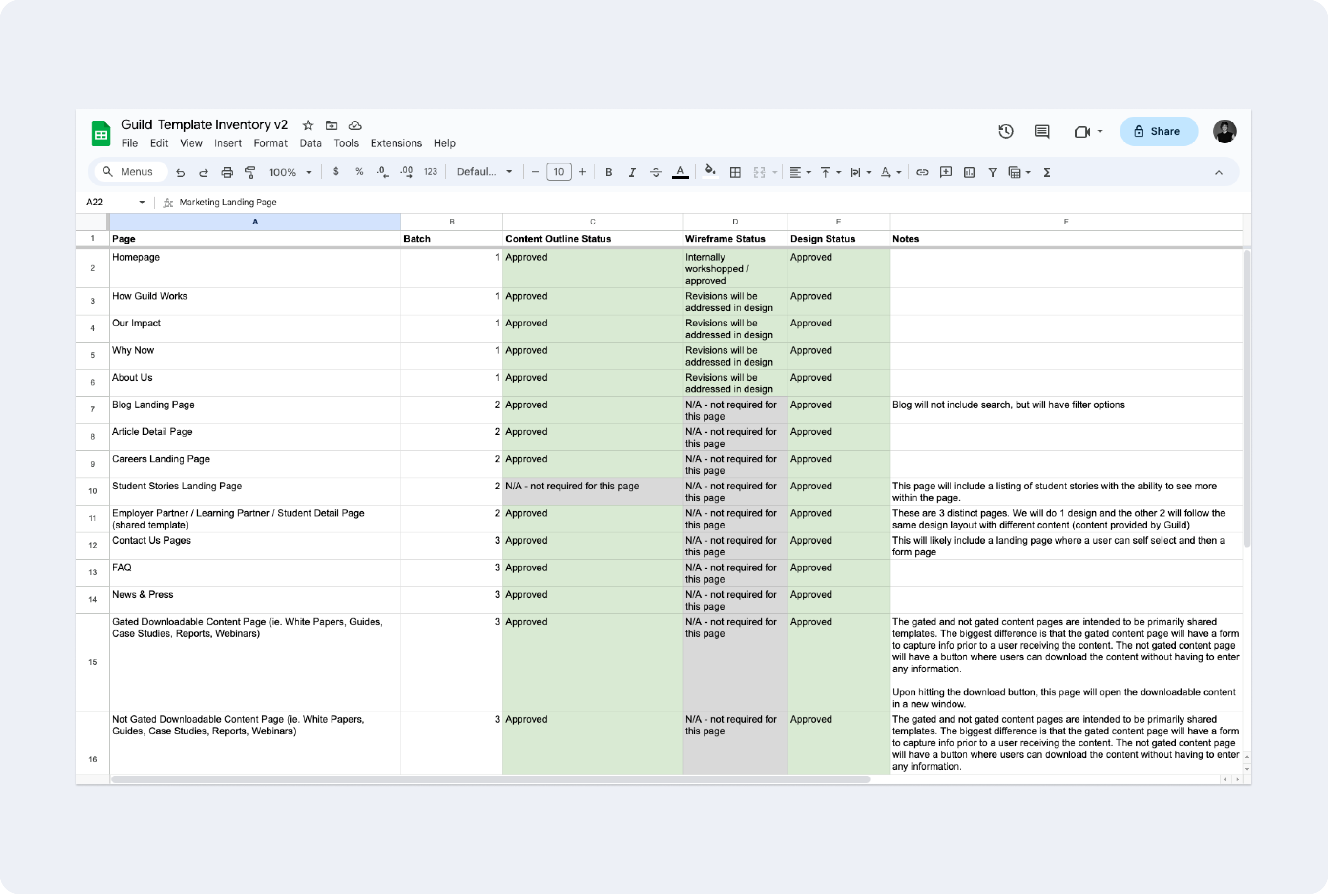
Working closely with the client through content strategy workshops
At this point we needed to know more specifically what types of content would live on each page, so we could design modules that could accommodate that content. We conducted a series of content strategy workshops with the client, ultimately co-creating content outlines for each of our main content-heavy pages. Below is a screenshot from one of our working sessions.
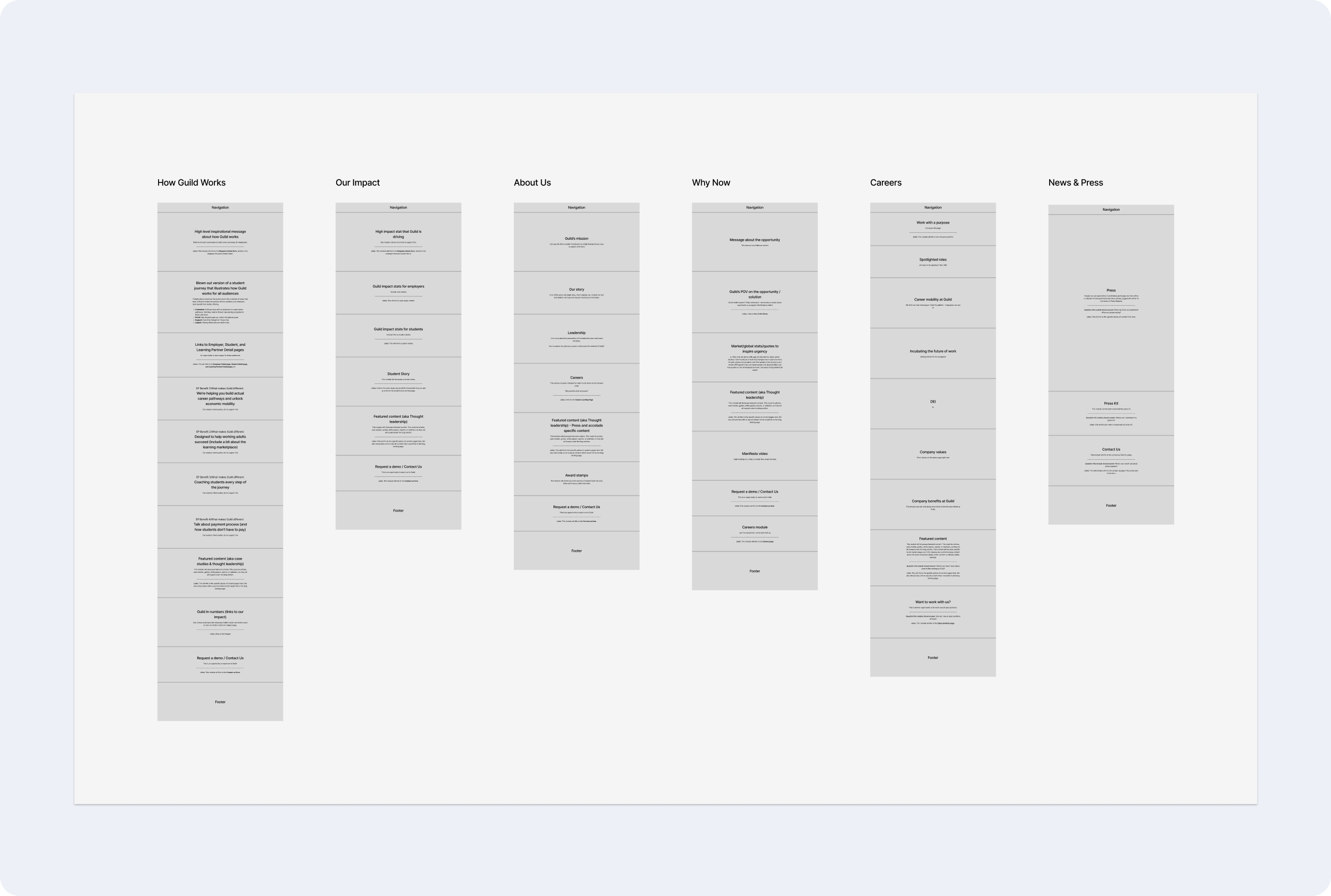
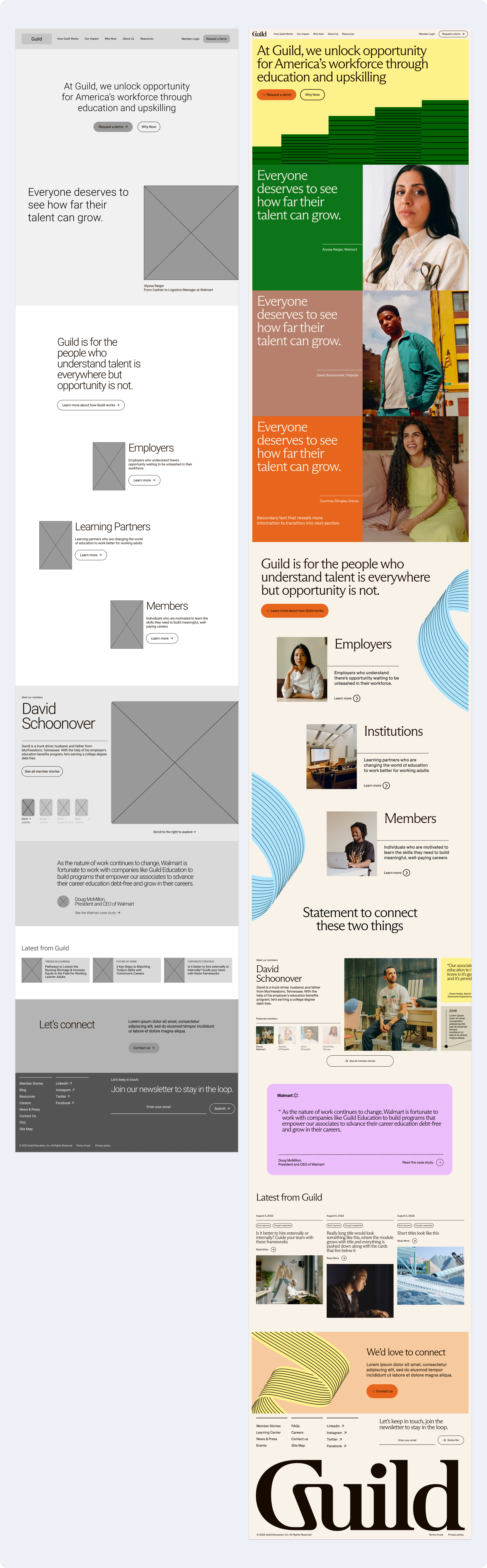
Working on wireframes and visual concepts simultaneously
We worked simultaneously on wireframes and visual concepting in order to meet our launch deadline, so we divided and conquered these two phases together. I worked on creating the wireframes based on the content outlines we had done. The two other designers worked on visual concepting together. We met frequently to give feedback and workshop our ideas and approaches to make sure we were in lock step.
The following image shows the homepage wireframe I created as well as the convergence of the visual concepts applied to the wireframe, which was done by the other designers.
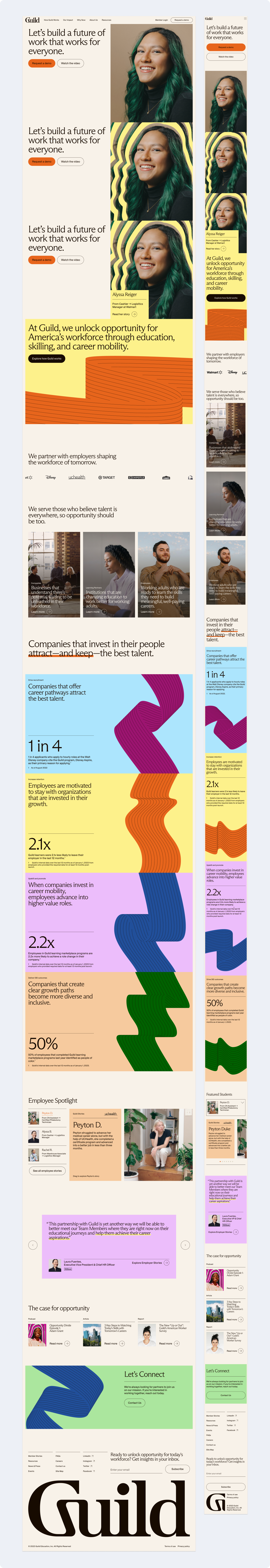
Building out designs, defining the visual language, and establishing motion principles
We built out our designs for each of the pages at desktop and mobile, exploring and refining the visual language and motion principles through the process.
Our motion principles were the foundation for all of the interactions on the site. They were based on Guild’s brand message “where your talent keeps rising”. Our motion principles included: growth, soft transitions, movement, and layering, which were all inspired by this concept of upward momentum and incorporated thoughtfully throughout the site.
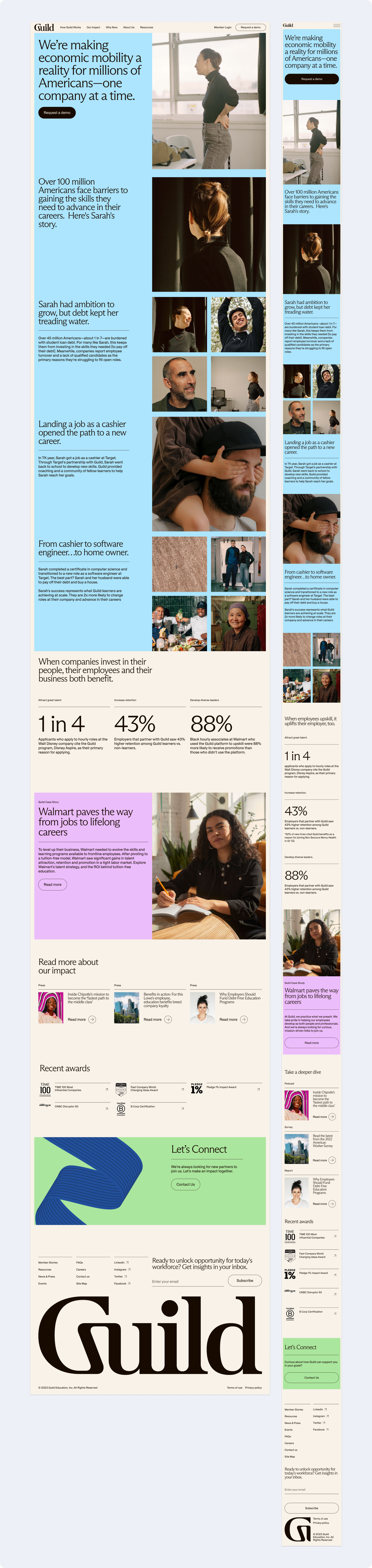
Designing highly flexible storytelling modules
There were many different storytelling modules throughout the site and the client wanted the flexibility to show and hide different pieces of information for each module. We needed to design each module with all of these specifics in mind and make sure that in the many different variations, the module still looked good.
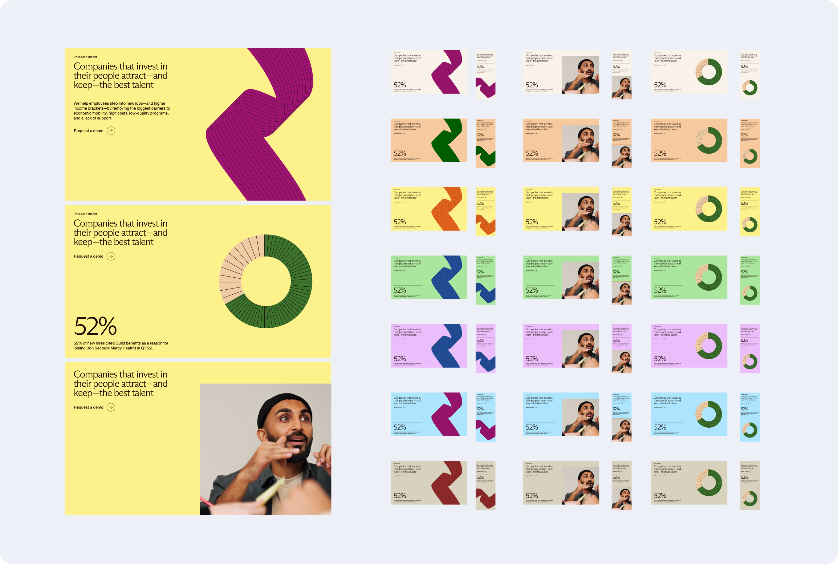
Working through different variations of the stats module
The stats modules were intended to do a lot of heavy lifting for the website and the client wanted them to be able to flex to fit different types of information. We had to ensure that each variation of these modules felt visually balanced and also design it in a way that would make sense systematically from a development perspective as well. Each module required a headline, but the rest of the elements could be swapped or turned on and off as needed.
Documenting all design elements in a UI and module library and handing off to the development team
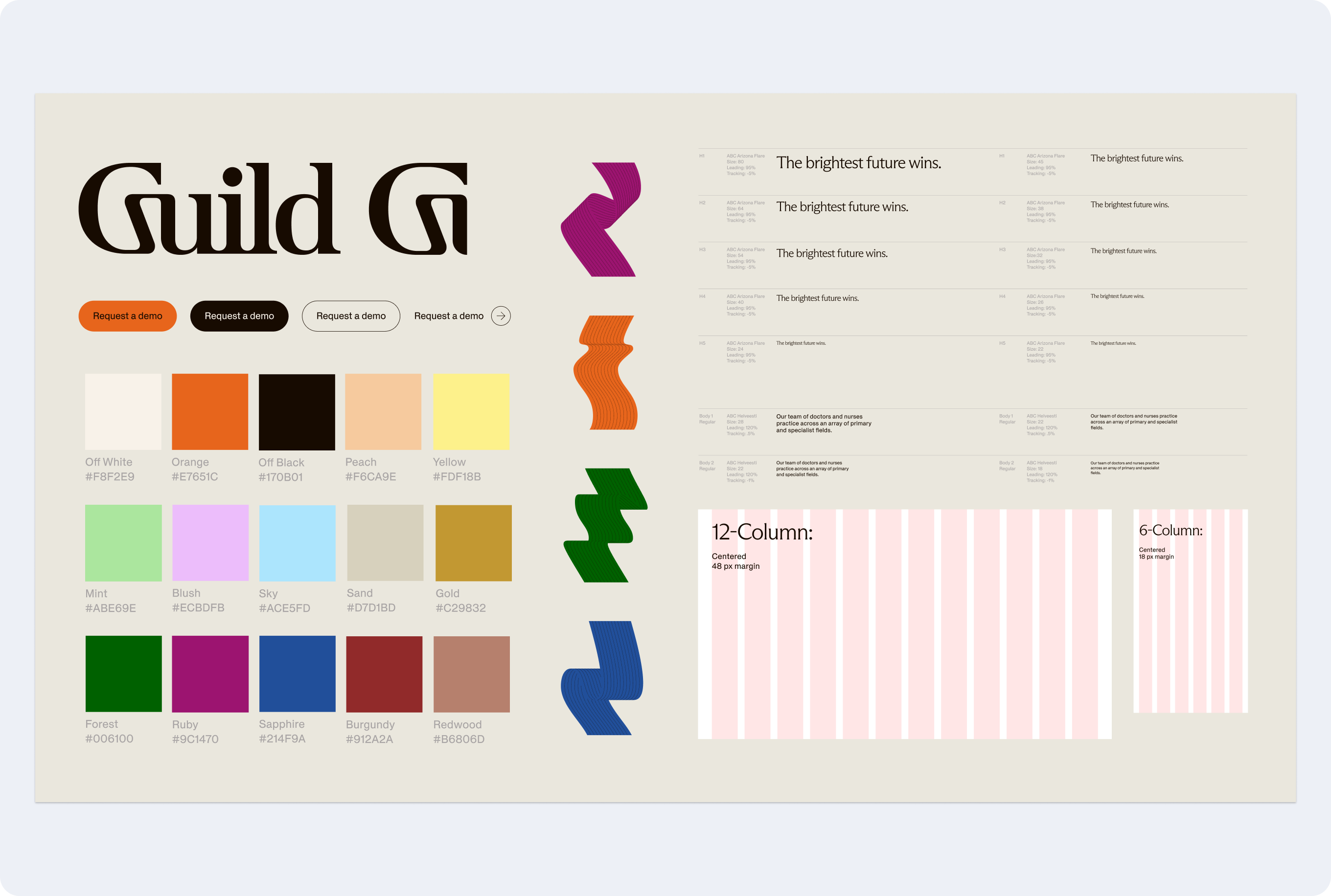
During the design process we worked to build out our atomic UI library so we could easily work using the same systematized colors, fonts, grids, and graphics. As we finalized module designs, we started building out a module library as well that included all of the different versions of each module, asset size guides, and a suggested word count range for each module.
Once designs had been finalized and approved, we handed off a comprehensive file to the developers and made ourselves available for any questions during the development process.
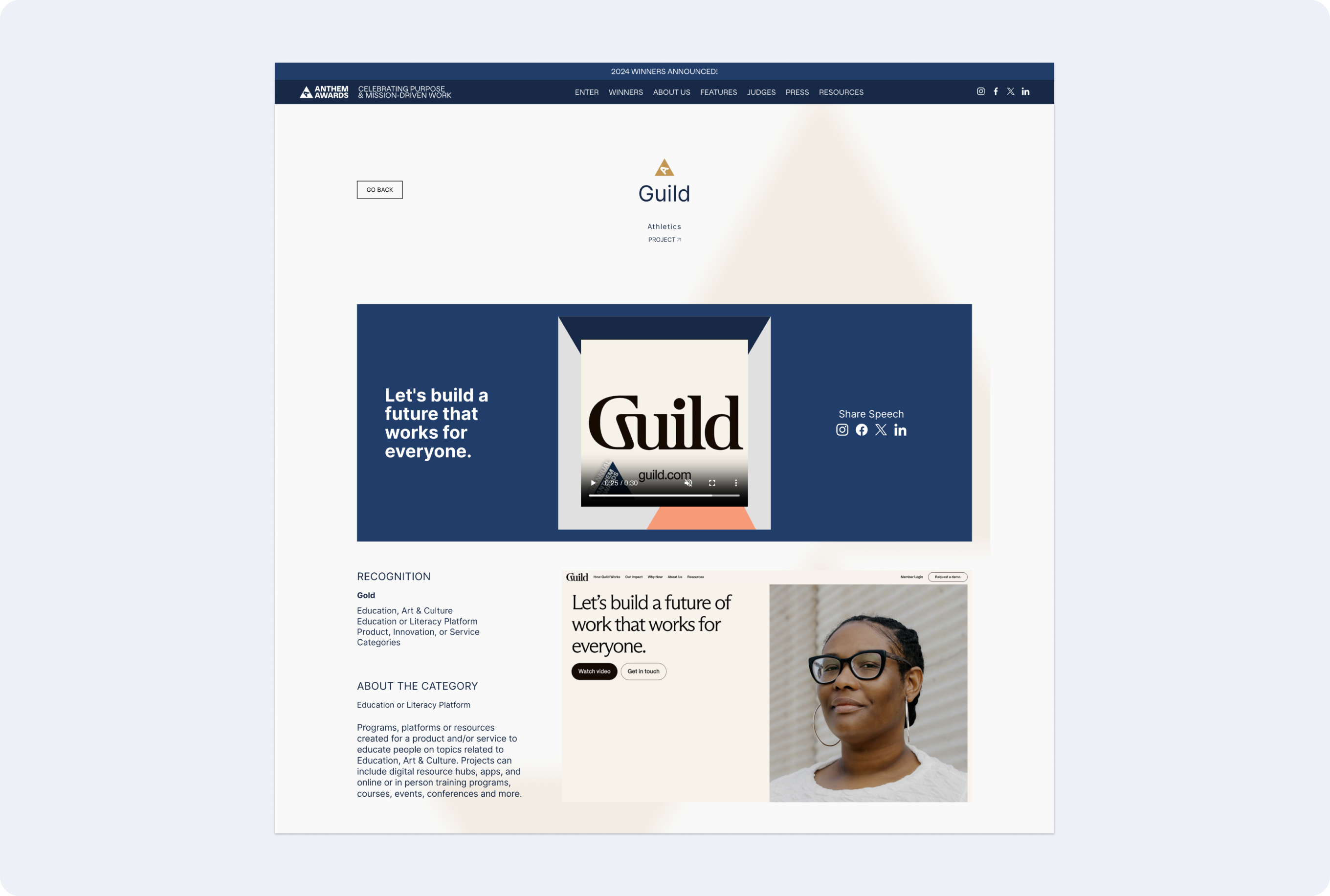
Winning a gold Anthem Award for the website
The Anthem Awards are a subdivision of the Webby awards, focusing on purpose and mission-driven work. The Guild website won a gold Anthem Award for Education Platforms for the website redesign work we did. You can read more about it here.